Showing posts with label Packaging Design. Show all posts

Friday, September 3, 2010

Heineken Icone Pure

Heineken and French designer ORA-ÏTO teamed up again after previous collaborations. Back in 2002 ORA-ÏTO received the ‘oscar for the best packaging’ for his aluminum Heineken bottle. The outcome of the latest collaboration is a new limited edition set of 100% sustainable aluminum bottles; the Icone Pure.

The new bottle is white with a green dotted inscription and featuring the iconic green logo of Heineken on the front and back. The packaging is successful in branding the bottle as “pure” and “green” while still maintaining the aesthetic of the Heineken brand. 

ORA-ÏTO is the brand name of the designer Ito Morabito. Ito Morabito describes his style as simplexity. He says, 'All my designs look very simple, but I can tell you it is very complex to make it happen.'

Thanks to Minimalissimo
for the info and photos!

Monday, August 30, 2010

KAWS x Dos Equis Beer Bottles


Mexican beer company Dos Equis has collaborate with Kaws on a two special bottle designs. Each bottle is representative of Dos Equis’ two offerings, a Lager and an Amber, and featuring Kaws signature “X Eyes” all over. For the moment it looks like the bottles will only be available in Mexico, starting September 2010.

Thanks to Hypebeast for the info!

Wednesday, April 21, 2010

Jailbreak Collective iPhone Magnets

Jailbreak Collective makes a really neat product that at first glance looks like a legit iPhone. If you look more closely, you'll see it's actually a package of iPhone-app-like magnets called App Magnets. They're not actually copies of Apple's designs. They're original artwork, done in-house.
The packaging is smart. It's incredibly low-cost and it's just a simple vacuum formed plastic insert and cover heat sealed to a simple iPhone-shaped card. (The package size is bigger than a real iPhone.) The minimal, copy-less design makes it all the more convincing. I also appreciate how they didn't over-package it. 
For all the iPhone freaks, check out Jailbreak Collective. Thanks for TheDIeline for the info and photos!

Saturday, April 17, 2010

PUMA Fuseproject Packaging


Puma has teamed up with America designer Yves Béhar from Fuseproject to redesign the shoe box. They suggests to the consumers to think about sustainability with an eco-friendly packaging. After 21 months, 2,000 ideas and 40 plus packaging prototypes, the team finally came up with this 'Clever Little Bag' solution which combines the two packaging components of any shoe sale – the bag and the box – with high-tech ingenuity. It's not only reduces materials but also shipping costs. 

The bag tightly wraps an interior cardboard scaffolding – giving it shape and reducing cardboard use by 65%. Moreover, without that shiny box exterior, there's no laminated cardboard (which interferes with recycling). There's no tissue paper inside. And there's no throw-away plastic bag. The bag itself is made of recycled PET, and it's non-woven – woven fibers increase density and materials use – and stitched with heat, so that it's less manufacturing intensive. 

Puma estimates the impact of this design will slash water, energy, and fuel consumption during manufacturing alone by 60% – in one year, that comes to a savings of 8,500 tons of paper, 20 million mega joules of electricity, 264,000 gallons of fuel, and 264 gallons of water. Ditching the plastic bags will save 275 tones of plastic, and the lighter shipping weight will save another 132,000 gallons of diesel. 

The roll-out is planned for next year. After that? Hopefully, the design will become ubiquitous. Also go to check out Fuseproject and PumaVISION for more info!

Saturday, April 3, 2010

Wicked Energy Drink

This collectible packaging for Australia's Wicked Energy Drink is designed by Kian Forreal, a talented Sydney-based tattoo artist. Wicked is inspired by the body art phenomenon that is sweeping the globe, and it is an all new energy drink combining tattoo attitude with caffeine and taurine. It comes in a fully illustrated 375ml can, as well as a 475ml fully sleeved PET bottle. Click here to check out more info!


Friday, April 2, 2010

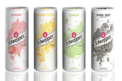
Schweppes Limited Edition Slim Cans


New limited edition for Schweppes Slim Can: metallic white with an explosion of simple geometric and coloured forms designed by french creative Fred & Farid. This special limited edition of Slim Cans are to be served only in clubs and bars and are treated to glow in the dark.
Thanks to TheDieline for the info and photos!

Sunday, February 7, 2010

Hermès Voyage


This is a new unisex fragrance by Hermès. The new perfume made by the luxury brand, is unisexual and will perfectly feature image of both men and women. The upcoming scent, based on musky and woody notes, developed by the major “nose” of Hermès, Jean-Claude Ellena.

He has created other fragrances Kelly Caleche, A Garden on the Nile or Terre d’Hermes. The new scent will be available in 35 ml and 100 ml in all Hermes boutiques in April.

The bottle was designed by Philippe Mouquet. Here’s what the press release says about the artist and his creation: “He would combine self-assurance with vivacity. This would be to the classic perfume bottle what the pocket magnifying glass was to the solid sort that lives in a desk, what a wristwatch is to a clock. It would open out at the touch of a finger, like pushing a door. It would turn on itself without going round. Not content with being merely mobile, it would be the incarnation of movement itself. Its material and colour would be aluminium, a material that reflects all others. Its contours would be those of a stirrup. Its axis a saddle tack. It would blend seamlessly with the hand. Would not be thrown away but kept. Refilled. And filled again. It would go away and stay on. Living a long time.”

Thanks to TheDieline for the info and photos!

Saturday, February 6, 2010

Milk Carton Postcards Project


A series of die-cut postcards from Malaysia-based design firm, Grass Studio, for Dasein Academy of Art that fold into miniature milk cartons.

As Dasein’s marketing communication demands more from postcard designs but production budget keep shrinking, they decided to recycle this die cut block & extend the idea into other low budget greeting occasions. Turns out, the project became a collection series that is highly sought after.

Thanks to TheDieline for the info and photos!

Tuesday, January 26, 2010

Dream Ball


This Dream Ball is designed by Unplug Design, South Korea.

To the children in The Third World: Tanzania, Rwanda, Burundi, Somalia, Congo and etc, who can’t enjoy football freely because of poverty, war and natural disaster, having a football means a lot and can be a dream and hope to escape from their poor life. However, the children are so poor that they can not buy a football. So, they play football with the ball made of plastic bag or coconut palm leaves, therefore giving them their own footballs which can give them hope.

This is the aim for this project.
This Dream Ball made of relief boxes delivered to those poor children by recycling.

  1. Create patterns that can help making a ball on the surface of an aid box.
  2. Activities of giving aid boxes to children in The Third World.
  3. The used aid boxes will be recycled as a football by children with the patterns on boxes.
  4. By making Dream Ball with the children together, the aid organizations will get the chance to be friendly with them.

Aid Box

If children take off the paper from an aid box by following the patterns on it, and assemble those parts with the attached instruction, they can get a football. Those patterns can apply on any type of boxes - a square type, a cylinder type. When children get a cyliner type aid box filled with supplies, they can move it by rolling that box.


The Football

In the aspect of material, Unplug Design considered children playing football with bare foot. So, they use paper that can be recycled and its thickness changes the intensity and elasticity of the Dream Ball.


For more info, go to Unplug Design!

Sunday, January 24, 2010

Hanger Tea


Designer Soon Mo Kang came with an extraordinary idea in packaging – Hanger Tea. The tee-shaped bags are suspended in the box from mini colourful hangers, which can then be hung on the rims of mugs.

"Design that makes you smile and most likely drink more tea!"

Thanks to Yanko Design for the info and photos!

Tuesday, January 5, 2010

Swiss Army Knife Chocolate


This delectable Swiss Chocolate Knife is made of the finest Swiss chocolate, and is filled with hazelnut praline. Featuring the Victorinox Swiss Army logo, this fine confection is modeled after the Swiss Army Spartan multitool. It is a wonderful treat for any Swiss Army Knife enthusiast!!!

Victorinox Swiss Army Spartan, Chocolate Edition Ingredients:


  • Sugar
  • Cocoa Butter
  • Powdered Whole Milk
  • Hazelnuts (13%)
  • Cocoa Fat
  • Vegetable Fat
  • Soy Flour
  • Emulsifiers
  • Natural Vanilla Flavoring
  • At least 35% Cocoa
Check out Swiss Knife Shop for more info!

Thursday, November 26, 2009

Colourless Coke Can

This "Colourless Coke Can" is designed by Ryan Yoon & Harc Lee, United States. A conceptual package design, which at this is unaffiliated with Coca Cola, created to drastically reduce the cost of both initial manufacturing and recycling.
“A convex logo substitutes colorfully sprayed can. Naked can help to reduce air and water pollution occurred in its coloring process. It also reduces energy and effort to separate toxic color paint from aluminum in recycling process. Huge amount of energy and paint required to manufacture colored cans will be saved. Instead of toxic paint, manufacturers process aluminum with a pressing machine that indicates brand identity on surface."

Thanks to Lovely Package for the info and photo!

Tuesday, November 3, 2009

Lavazza Cookie Cup

Venezuelan designer Enrique Luis Sardi has teamed up with Italian coffee company Lavazza to create a master piece of green design – Cookie Cup!

First you drink the coffee, then you eat the cup! Brilliant! Cookie Cup is an example of the results achieved from research into food design: it's not just about coffee, but also the container – because once you have enjoyed the dark beverage you can also eat the cup. The cup is made of pastry covered with a special icing sugar, which works as an insulator, and makes the cup waterproof hence allowing you to use the cup and then appreciate its taste, so to eat and drink coffee along with a biscuit at the same time.

It looks so cool! I also want to try this Cookie Cup with coffee! Check out Lavazza for more info!

Green Berry Tea – Origami Tea Packaging

Cool tea packaging concept designed by Natalia Ponmareva from Russia. Each creative tea bag looks like a beautiful origami bird. Thanks to Toxel for the info and photos!

Sunday, November 1, 2009

Creative Review Incredible Dissolving Bag

Creative Review is the first magazine anywhere to trial a new packaging material called harmless-dissolve which was created in the UK by Cyberpac.

Take the magazine out of the bag.

Cut off the sealing strip – the glue of the strip is biodegradeable but will not dissolve in water.

Place the bag in a receptacle filled with hot water (60+ degrees recommended by manufacturer).

The clear plastic dissolves into the water almost immediately.

The printed area takes a little longer to break down.
After a couple of minutes, the printed area has broken down sufficiently for it to disintegrate when rubbed between finger and thumb – it's a bit gunky and sticky but washes off straightaway.
Pour the residue down the drain.
Any residue is perfectly harmless. Apparently you can even drink it, but it tastes horrible! Not recommend this!
A quick sluice around with water clears up any remaining residue both in the sink and in the receptacle.
Go to Creative Review for more info!

Wednesday, October 21, 2009

Bill's Dairy Farm

Bill's Dairy Farm in South Africa invited ilovedust to create carton graphics for their new range of milkshakes. Featuring strawberry, chocolate and vanilla flavours, each individual graphic features its own character and specific colour scheme. The colourful, funny and candy shop style packaging is designed to appeal to a young target market. Thanks to TheDieline for the info and photo!

Sunday, October 18, 2009

Audiovox EarBudeez

JayD
Jill

Zoie Jane
Emo
Rojo

Bodie
JDA, Inc. Retail Ready Design recently won the 2009 Gold Pentawards for these very awesome earphones for Audiovox.

Audiovox
found that customers choose their earbuds like a fashion accessory and packaging is key to heir choice. JDA developed the earBudeez series as personalities with the earbuds as eyes in different positions to convey attitudes and emotions. These fun, eye-catching packages appeal to customers of all ages who want to express themselves with a unique product.

Thanks to
Packaging of the World for the info and photos!