Showing posts with label Graphic Design. Show all posts

Sunday, May 23, 2010

Paul Smith x Burton Vapor Snowboard

 British designer Paul Smith re-unites with Burton once again in a release of a snowboard slated for the 2011 season. The collaborative Paul Smith Vapor snowboard is an exemplification of both labels’ dictum for impeccable shapes and love for colors. On the upper, the snowboard is kept restrained and cool in black, with a pop of color in the channel which allows for use with both the Burton EST and Burton 3D bindings; and on the flip side, things get a little wild as Paul Smith’s iconic rainbow stripes are interlaced with bold Burton logo. The Vapor is a lightweight board which allows for an effortless ride.

The snowboard collaboration comes on the heels of three previous collaborations starting in 2005 which has revolved around on-hill apparel. The Paul Smith x Burton Vapor Snowboard will retail for $1,199.95 USD and be available in mid-August through Burton.com. So those who are thinking of upgrading their gear and look, here is a good option to consider before powder season kicks in.

Thanks to Hypebeast for the info and photo!

Monday, April 5, 2010

Nike Air Max 90 Sneaker Advert Tutorial


I eventually got some spare time to finish this tutorial. It's an awesome and useful tutorial! I especially like the part about teaching how to draw and customize the wavy lines, and how to use a variety of lighting effects in Photoshop. Click here if you want to learn this tutorial.

Saturday, April 3, 2010

Wicked Energy Drink

This collectible packaging for Australia's Wicked Energy Drink is designed by Kian Forreal, a talented Sydney-based tattoo artist. Wicked is inspired by the body art phenomenon that is sweeping the globe, and it is an all new energy drink combining tattoo attitude with caffeine and taurine. It comes in a fully illustrated 375ml can, as well as a 475ml fully sleeved PET bottle. Click here to check out more info!


Friday, April 2, 2010

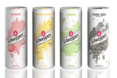
Schweppes Limited Edition Slim Cans


New limited edition for Schweppes Slim Can: metallic white with an explosion of simple geometric and coloured forms designed by french creative Fred & Farid. This special limited edition of Slim Cans are to be served only in clubs and bars and are treated to glow in the dark.
Thanks to TheDieline for the info and photos!

Wednesday, February 17, 2010

Cheeming Boey – Styrofoam Cup Art


Incredible illustrations by California based artist Cheeming Boey, using styrofoam cups as his canvas. Employing one of our favourite pens – Sharpie Marker, he’s developed his own style, which is influenced by pointillism and Japanese woodcuts. All of his designs are one of a kind, and no two are alike.
I've posted a few of my favourite cups from Boey’s collection. There are more on his website!
Thanks to PSFK for the info!

Saturday, February 6, 2010

Milk Carton Postcards Project


A series of die-cut postcards from Malaysia-based design firm, Grass Studio, for Dasein Academy of Art that fold into miniature milk cartons.

As Dasein’s marketing communication demands more from postcard designs but production budget keep shrinking, they decided to recycle this die cut block & extend the idea into other low budget greeting occasions. Turns out, the project became a collection series that is highly sought after.

Thanks to TheDieline for the info and photos!

Wednesday, December 30, 2009

Creative Heineken Beer Ads

Heineken has always been one of my favourite companies for advertising. Their advertising is at times so simple and yet so powerful. The followings are the most creative and unusual advertising campaigns for Heineken beer.


Heineken Christmas Tree
A giant christmas tree was made with 1000 Heineken beer bottles in front of the Nanjing shopping mall in Shanghai. Click here for more info.


Heineken Beer Billboard
This outdoor campaign from Heineken in Amsterdam is an example of how an innovative idea can have a huge impact in a traditional approach. Click here for more info.


Heineken Rugby Shirt
Heineken: The official beer for Singapore Rugby Sevens. Click here for more info.


"Don't Drink and Drive" Heineken Ad
When you drink your reaction time slows down. Heineken: Don't drink and drive! Click here for more info.


Heineken Pizza Boxes
Heineken: "Made to Entertain" advertisement. Pizza boxes were cleverly used to promote Heineken beer. Click here for more info.


Heineken CDs
Heineken: "Made to Entertain" advertisement. Stack of music CDs was cleverly used to promote Heineken beer. Click here for more info.


Heineken Snow Ad
Heineken beer helps relax after skiing and snowboarding. Click here for more info.


Heineken Cities
Heineken is presented as the beer of choice for a Fresher World, with the cityscapes of Paris, Manhattan and Rio de Janeiro illustrated with Heineken bottles, cans and cartons. Click here for more info.


Heineken Chart
A creative chart used to promote Heineken beer. Click here for more info.


Heineken "Bottoms Up" Ad
Two bottles of Heineken upside down! The idea of a sexy woman long beautiful legs makes your mouth water and makes people craving a cold Heineken beer. Click here for more info.


Heineken: Drink the Music
This campaign has presented Michael Jackson, Ozzy Osbourne and Elvis Presley in a unique avatar. The print advertising campaign while aiming youth customers has used the fame of these pop stars in order to reflect its natural association with music. Click here for more info.


Seen+Noted: Directions to a Heineken
Leo Burnett, Bangkok, wanted an eye-catching promotional idea to launch the Heineken GreenSpace Beer Park located on the rooftop of the CentralWorld Plaza in Bangkok. THe agency created 'green men' and formed them into the shape of the Heineken bottle and used it as a directional installation that pointed to the location of the bar day and night. Click here for more info.

Tuesday, November 24, 2009

A Spectacular Grass Text Effect

Great~ I finally finished this "Grass Typo" tutorial. It's a good try to make text out of grass. In this tutorial, I learnt how to create a cool-looking grass typo using a photo of grass in Photoshop. But the annoying part was using the pen tool to outlining each letter from the grass photo.

Anyway, if you guys want to know how to create this awesome grass typo, click here to learn!

Tuesday, November 3, 2009

Green Berry Tea – Origami Tea Packaging

Cool tea packaging concept designed by Natalia Ponmareva from Russia. Each creative tea bag looks like a beautiful origami bird. Thanks to Toxel for the info and photos!

Sunday, November 1, 2009

Creative Review Incredible Dissolving Bag

Creative Review is the first magazine anywhere to trial a new packaging material called harmless-dissolve which was created in the UK by Cyberpac.

Take the magazine out of the bag.

Cut off the sealing strip – the glue of the strip is biodegradeable but will not dissolve in water.

Place the bag in a receptacle filled with hot water (60+ degrees recommended by manufacturer).

The clear plastic dissolves into the water almost immediately.

The printed area takes a little longer to break down.
After a couple of minutes, the printed area has broken down sufficiently for it to disintegrate when rubbed between finger and thumb – it's a bit gunky and sticky but washes off straightaway.
Pour the residue down the drain.
Any residue is perfectly harmless. Apparently you can even drink it, but it tastes horrible! Not recommend this!
A quick sluice around with water clears up any remaining residue both in the sink and in the receptacle.
Go to Creative Review for more info!

Wednesday, October 21, 2009

Bill's Dairy Farm

Bill's Dairy Farm in South Africa invited ilovedust to create carton graphics for their new range of milkshakes. Featuring strawberry, chocolate and vanilla flavours, each individual graphic features its own character and specific colour scheme. The colourful, funny and candy shop style packaging is designed to appeal to a young target market. Thanks to TheDieline for the info and photo!

Sunday, October 18, 2009

Audiovox EarBudeez

JayD
Jill

Zoie Jane
Emo
Rojo

Bodie
JDA, Inc. Retail Ready Design recently won the 2009 Gold Pentawards for these very awesome earphones for Audiovox.

Audiovox
found that customers choose their earbuds like a fashion accessory and packaging is key to heir choice. JDA developed the earBudeez series as personalities with the earbuds as eyes in different positions to convey attitudes and emotions. These fun, eye-catching packages appeal to customers of all ages who want to express themselves with a unique product.

Thanks to
Packaging of the World for the info and photos!