
The aim of this article is to raise awareness and educate new Photoshop users and designers. It's not to make fun of or mock the one's who use the below techniques and practices. Below is a list of 12 common mistakes, misuses and various ways new users abuse Photoshop. The information and photos are provided by TDC.
Improper Extraction Methods


Many new and unexperienced Photoshop users rely on the magic wand, quick select or lasso tool to extract backgrounds or objects in an image. Photoshop's "easy" selection and extraction methods have come a long way, but it still doesn't compare to the precision you get with the pen tool. Click here to know more about pen tool.
The pen tool can be quite tricky to new users, but once mastered you will wonder how you ever used any other method. Click here to learn another method of quick masking or extraction. Just don't use the eraser tool!
Moreover, it's good to add a slight feather to your extractions to improve the appearance of your images.
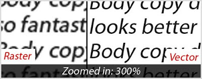
Setting Body Copy
The pen tool can be quite tricky to new users, but once mastered you will wonder how you ever used any other method. Click here to learn another method of quick masking or extraction. Just don't use the eraser tool!
Moreover, it's good to add a slight feather to your extractions to improve the appearance of your images.
Setting Body Copy

Photoshop can be used to create fantastic text effects, but that doesn't mean you should use it for large areas on text, especially for body copy. Doing large amounts of text should work in InDesign, Quark or even, Illustrator.
Your text will not print as clear and sharp in a raster-based program like Photoshop. Therefore, stick with vector-based programs for large amounts of text.
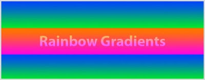
Using Rainbow Gradients
Your text will not print as clear and sharp in a raster-based program like Photoshop. Therefore, stick with vector-based programs for large amounts of text.
Using Rainbow Gradients

You know you've seen them a million times, and every time they get more jarring to look at. Just say no to rainbow gradients! Click here to see the awful rainbow colour.
It doesn't mean that you should stay away from gradients. Nowadays, there are a lots of designs and websites using tactful gradients. Try blending the gradients from a lighter shade to a darker shade of the same colour scheme, instead of blending two or more disconnecting colours.
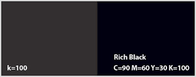
Assuming K=100 is Black
It doesn't mean that you should stay away from gradients. Nowadays, there are a lots of designs and websites using tactful gradients. Try blending the gradients from a lighter shade to a darker shade of the same colour scheme, instead of blending two or more disconnecting colours.
Assuming K=100 is Black

Many new designers thought that setting K in CMYK to 100 would result in black. This is not right! It results in a dark grey. Try using C=90 M=60 Y=30 K=100 from now on. It will produce a much richer and noticeable black.
Overusing and Abusing Filters
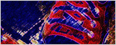
Even though they're fun and easy doesn't mean they make you look professional and experienced. Oversuing and misusing filters can easily make you look like an amateur.
Creating Logos in Photoshop

Overusing and Abusing Filters

Even though they're fun and easy doesn't mean they make you look professional and experienced. Oversuing and misusing filters can easily make you look like an amateur.
Creating Logos in Photoshop

Though this one can be argued, you should create logos in vector-based programs, like Illustrator, as mush as possible. Vectors are easily scalable and retain consistent clarity no matter how large or small you scale them.
Working Under 300dpi in Print
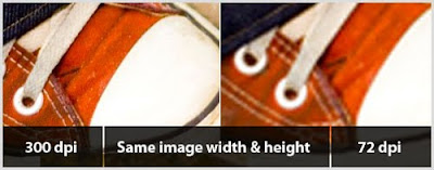
Working Under 300dpi in Print

Many new users fall into the trap of working in 72dpi (dots per inch). While this is true for the web, IT SHOULD NOT BE USED WHEN PRINTING. Typically 300dpi is best for print, but you should always check with your printer.
Besides, when working with images that are 72dpi in print, don't assume you can just increase the resolution or size of the image and everything will be fixed. The image will appear pixelated once printed.
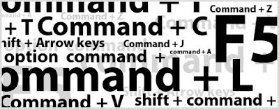
Not Learning Shortcuts
Besides, when working with images that are 72dpi in print, don't assume you can just increase the resolution or size of the image and everything will be fixed. The image will appear pixelated once printed.
Not Learning Shortcuts

No matter which program you are working in, learning shortcuts is a must. Not only increasing your work flow and saving your valuable time, but also most of the tools require additional keys for added functionality.
Not Using Layers and Folders
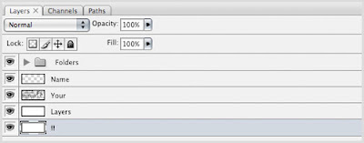
Everything in Photoshop revolves around layers. Many new Photoshop users neglect using layers. Working in layers is a good habit and it is much easier for you to edit, move, duplicate and delete, etc.
Also, naming your layers and structuring them into folders is essential, especially when dealing with large PSD files or if you're a web designer. It will help you to navigate around your project and save your time.
"Desaturate" to Convert Images to Black & White

This one is often over looked, even by experienced designers. Choosing "Image > Adjustments > Desaturate" to convert your image to black & white, often produces a flat and "lifeless" photograph. Try to convert your image by choosing "Image > Adjustments > Channel Mixer". Check off "Monochrome" and then adjusting the Red, Green and Blue channel slliders. This process will produce a much richer image.
Beveled, Embossed and Drop Shadows

Beveled, Embossed and Drop Shadows

Similar to rainbow gradients and abusing filters, beveled or embossed text can be labeled as uexperienced. Unless you have a valid reason, stay clear of these or use sparingly.
Drop shadows should also be treated properly and with care. When applying a drop shadow, pay attention to other lighting in the image. You don't want drop shadows coming from all directions causing an image to appear unbelievable or fake. Moreover, adjusting or toning down drop shadows is important as well. They should be subtle and soft, not dramatic and harsh.
Not Taking Advantage of Guides and Grids
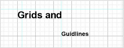
You wouldn't believe how many designers "eye" things up instead of pulling out guides or using the grid in Photoshop. They're there for a reason! Use them!Drop shadows should also be treated properly and with care. When applying a drop shadow, pay attention to other lighting in the image. You don't want drop shadows coming from all directions causing an image to appear unbelievable or fake. Moreover, adjusting or toning down drop shadows is important as well. They should be subtle and soft, not dramatic and harsh.
Not Taking Advantage of Guides and Grids

No comments:
Post a Comment