Saturday, September 26, 2009
Paul Smith x Evian
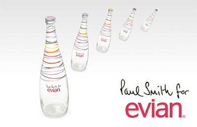
Following its annual trend in partnerships with Fashion Designers through 2010, Evian has linked up with one of the most creative designers, known for his sense of fun and optimistic attitude – Paul Smith.
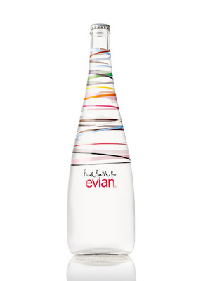
The new exclusive Evian bottle is designed with a festive theme in vibrant colours – with a nod to the famous Paul Smith stripes – which elegantly underlines the purity of the natural spring water from the French Alps. Miles away from the traditional holiday themes, Evian offers an experience of youth in a multi-coloured bottle with five different caps to collect.
The new Paul Smith x Evian limited edition collection will be available pre-sale on www.ShopEvian.com beginning 22 September 2009, and available at fine dining establishments and gourmet retailers beginning in November 2009.
Thanks to TheDieline for the info!
Sunday, September 20, 2009
A Bathing Ape "Baby Milo" Earphone
Another interesting products released from Bape are these A Bathing Ape “Baby Milo” Earphones. With Baby Milo on the back of the earphones, who could resist wondering why there are monkeys stuck in your ears. Available now in two colours (black & white) at Bape Stores for 3,990 YEN. Thanks to Hypebeast for the info and photo.
Saturday, September 19, 2009
Awesome Milk Typography
What a nice Saturday!? But I don't know why I'm so sleepy all day. So, I spent all the time on my bed. Great! Such a lazy pig!
I did this milk typography tutorial (see above) a week ago, but I just can't find a time to upload it here. It's an incredible and awesome tutorial! Not just milk, you can try some other liquid photos to make this effect. Click here to learn this tutorial.
Saturday, September 12, 2009
Common Typography Mistakes
This post is to help designers to understand the importance of good typography and avoid some common mistakes. Below is a list of common mistakes used in type design or layout that can make a large impact in the effectiveness and appearance of your designs. It's good to avoid making these mistakes in order to save your time and money when dealing with printers. The info and images are provided by TDC. Thanks!
Not Enough Leading
Leading or line spacing can improve the overall readability of large blocks of text on a page, making it easier for readers to follow the lines of text without losing their place. Too little leading or line spacing may cause a cramped feeling. It's important to remember that different fonts need different line spacing. Varying heights in letterforms may demand more or less.
Not Enough Tracking
Tracking or letter spacing is applied to a group of letters. It prevents letters from running into each other, especially during print. It's similar to leading in which it can improve or hinder readability, flow of text and the density or weight of a block of text.
Getting Tracking Confused with Kerning
While tracking is applied to a group of characters, kerning is the adjustment of space between two letter pairs. Effective for headlines, text with ALL CAPS and logo treatments (it helps with readability at various sizes). Don't fall into the trap of letting your design software set this by default; it's character specific. Same applies to the above rules.
Lengthy Lines of Text
Reading many long lines of text causes eye fatigue. Readers are forced to moves their heads and eyes more often from one line to the next. Research states to keep lines of text under 50-60 characters long.
Mixing Too Many Typefaces and Weights
Too many typefaces on one page can become distracting and disconnecting (lacking unity). Try keeping your fonts choices to three or less per project. Too many weights can cause readers to be unclear where the important elements are on the page and create the possibility of readers missing something important.
Not Using Serif Fonts for Lengthy-Text Material
Serif fonts are known to make reading lengthy material, such as books and magazines, more sustainable for longer periods of time. It also helps with eye strain or fatigue, and we all know that we need our eyes! Although this can be argued, serif fonts seem to sit better on the baseline.
Printing Similar Values of Colour on Top of Each Other
For example, try printing a medium blue text on top of a medium brown box. Not just unappealing, but it makes it hard for eyes to read. It also creates a muddy effect.
Reversed Out Text on Less than 50% Tints
Much like the above, this also increases eye strain and hinders readability. The words get lost in the background and typically prints less visible than seen on screen.
Overusing Centered Text
Using centered text creates a jagged and broken appearance to text – very disconnecting! Can be viewed as amateurish in most instances. Save it for those wedding invitations.
Large Body Copy
Normally, designers and non-designers will immediately use 12 point size font for body copy. Smaller font size creates a more professional and modern look. Large body text can be clunky – think about the font size of a children's book. Clunky enough, right?
It's also important to note that viewing text on a computer monitor is much different than printing it. In most instances, type on a screen appears smaller and less crisp. Also, most printers will advise you not to use font size under 7 points due to readability issues.
Not Knowing What the Grid System Is
Understanding the grid is one important thing for a typography enthusiast. It's the basis for creating clarity and making your type and layouts more cohesive. Check out the site, The Grid System, for links and resources pertaining to grid systems.
Thursday, September 10, 2009
Kidrobot x David Weeks – "Chiseler" Dunny
Kidrobot’s popular Dunny figure ventures into a new direction with a special piece created by Brooklyn-based designer David Weeks. Named "Chiseler", the figure is “modeled after Weeks’ poseable timber toys Hanno the Gorilla and Ursa the Bear”. The limited edition run of 5 Chiseler Dunnys include zebra-striped hard pine with sharped angular facets unlike the Dunny’s usual smooth plastic surface and free-flowing lines. Also including a swivel head and set of arms for some manipulative fun. This limited edition toy comes in a custom wooden-crate packaging and is set to release on 22nd September at Kidrobot NY and Kidrobot.com. Thanks to Freshness for the info and photos.
Tuesday, September 8, 2009
The East Kitchen's Posters
I eventually finished working the A3 size posters (see above) for my uncle's restaurant – The East Kitchen. It's a modern Chinese restaurant situated in Dickson, Canberra. If you guys have time, should go and try it! It also offers self-service Chinese bakery food on Tuesdays, Fridays and Saturdays. You can find all different kinds of Chinese-style buns. I especially like the BBQ pork bun, red bean bun and coconut-custard bun. Yum-yum! The address is Shop 2 Dickson Plaza, 28 Challis Street, Dickson, ACT 2602. The contact number is (02) 6262 6889.
Sunday, September 6, 2009
Red Wing 8130 Classic Mod Boot
Red Wing have announced their latest 8130 Classic Mod boot, to be available in black chrome, oro russet, portage and briar oil slick colourways. The shoes are oil-tanned and water-repellent, full-grained leather boots equipped with a Traction-Tred crepe wedge non-slip sole, a sweat resistant leather insole, silver eyelets and white contrast stitching. Made in USA. The boots are available at Blackbird. Thanks to Hypebeast for the info.
Thursday, September 3, 2009
Common Photoshop Mistakes and Malpractice
The aim of this article is to raise awareness and educate new Photoshop users and designers. It's not to make fun of or mock the one's who use the below techniques and practices. Below is a list of 12 common mistakes, misuses and various ways new users abuse Photoshop. The information and photos are provided by TDC.
Many new and unexperienced Photoshop users rely on the magic wand, quick select or lasso tool to extract backgrounds or objects in an image. Photoshop's "easy" selection and extraction methods have come a long way, but it still doesn't compare to the precision you get with the pen tool. Click here to know more about pen tool.
The pen tool can be quite tricky to new users, but once mastered you will wonder how you ever used any other method. Click here to learn another method of quick masking or extraction. Just don't use the eraser tool!
Moreover, it's good to add a slight feather to your extractions to improve the appearance of your images.
Setting Body Copy
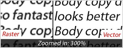
Photoshop can be used to create fantastic text effects, but that doesn't mean you should use it for large areas on text, especially for body copy. Doing large amounts of text should work in InDesign, Quark or even, Illustrator.
Your text will not print as clear and sharp in a raster-based program like Photoshop. Therefore, stick with vector-based programs for large amounts of text.
Using Rainbow Gradients
Your text will not print as clear and sharp in a raster-based program like Photoshop. Therefore, stick with vector-based programs for large amounts of text.
Using Rainbow Gradients
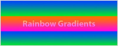
You know you've seen them a million times, and every time they get more jarring to look at. Just say no to rainbow gradients! Click here to see the awful rainbow colour.
It doesn't mean that you should stay away from gradients. Nowadays, there are a lots of designs and websites using tactful gradients. Try blending the gradients from a lighter shade to a darker shade of the same colour scheme, instead of blending two or more disconnecting colours.
Assuming K=100 is Black
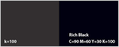
Many new designers thought that setting K in CMYK to 100 would result in black. This is not right! It results in a dark grey. Try using C=90 M=60 Y=30 K=100 from now on. It will produce a much richer and noticeable black.
Overusing and Abusing Filters
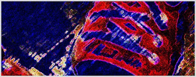
Even though they're fun and easy doesn't mean they make you look professional and experienced. Oversuing and misusing filters can easily make you look like an amateur.
Creating Logos in Photoshop
Overusing and Abusing Filters
Even though they're fun and easy doesn't mean they make you look professional and experienced. Oversuing and misusing filters can easily make you look like an amateur.
Creating Logos in Photoshop
Though this one can be argued, you should create logos in vector-based programs, like Illustrator, as mush as possible. Vectors are easily scalable and retain consistent clarity no matter how large or small you scale them.
Working Under 300dpi in Print
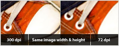
Many new users fall into the trap of working in 72dpi (dots per inch). While this is true for the web, IT SHOULD NOT BE USED WHEN PRINTING. Typically 300dpi is best for print, but you should always check with your printer.
Besides, when working with images that are 72dpi in print, don't assume you can just increase the resolution or size of the image and everything will be fixed. The image will appear pixelated once printed.
Not Learning Shortcuts
Besides, when working with images that are 72dpi in print, don't assume you can just increase the resolution or size of the image and everything will be fixed. The image will appear pixelated once printed.
Not Learning Shortcuts
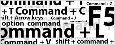
No matter which program you are working in, learning shortcuts is a must. Not only increasing your work flow and saving your valuable time, but also most of the tools require additional keys for added functionality.
Not Using Layers and Folders
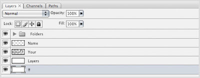
Everything in Photoshop revolves around layers. Many new Photoshop users neglect using layers. Working in layers is a good habit and it is much easier for you to edit, move, duplicate and delete, etc.
Also, naming your layers and structuring them into folders is essential, especially when dealing with large PSD files or if you're a web designer. It will help you to navigate around your project and save your time.
"Desaturate" to Convert Images to Black & White
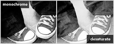
This one is often over looked, even by experienced designers. Choosing "Image > Adjustments > Desaturate" to convert your image to black & white, often produces a flat and "lifeless" photograph. Try to convert your image by choosing "Image > Adjustments > Channel Mixer". Check off "Monochrome" and then adjusting the Red, Green and Blue channel slliders. This process will produce a much richer image.
Beveled, Embossed and Drop Shadows
Similar to rainbow gradients and abusing filters, beveled or embossed text can be labeled as uexperienced. Unless you have a valid reason, stay clear of these or use sparingly.
Drop shadows should also be treated properly and with care. When applying a drop shadow, pay attention to other lighting in the image. You don't want drop shadows coming from all directions causing an image to appear unbelievable or fake. Moreover, adjusting or toning down drop shadows is important as well. They should be subtle and soft, not dramatic and harsh.
Not Taking Advantage of Guides and Grids
You wouldn't believe how many designers "eye" things up instead of pulling out guides or using the grid in Photoshop. They're there for a reason! Use them!Drop shadows should also be treated properly and with care. When applying a drop shadow, pay attention to other lighting in the image. You don't want drop shadows coming from all directions causing an image to appear unbelievable or fake. Moreover, adjusting or toning down drop shadows is important as well. They should be subtle and soft, not dramatic and harsh.
Not Taking Advantage of Guides and Grids
Subscribe to:
Posts (Atom)