Sunday, February 28, 2010

It's Not How Good You Are, Its How Good You Want to Be. By Paul Arden

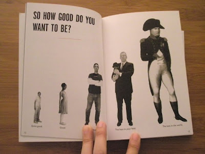
I just finished reading a book which is called "It's Not How Good You Are, It's How Good You Want to Be". This book is great and gives you lots of inspirations. It’s a quick read and seems to the point throughout. It reminds you that you don’t know everything you think you know and to move forward in your career or life. You must open yourself up to criticism and make mistakes, and you control your own destiny. I like the thoughts about "It's wrong to be right. It's right to be wrong." I agree that being right is based upon knowledge and experience, but it's boring and is the opposite of creative. However, being wrong opens up the opportunity of trying new things and maybe becoming right.

I love the layout and the typo! The pictorial and the design is quite clever because not only conveying the message better, it also makes the book much more enjoyable to read. I strongly recommend this book to everyone, especially people working in design, advertising and marketing industries!

Here is some info about the book:

It's Not How Good You Are, It's How Good You Want to Be is a handbook of how to succeed in the world – a pocket 'bible' for the talented and timid to make the unthinkable thinkable and the impossible possible. 

The world's top advertising guru, Paul Arden, offers up his wisdom on issues as diverse as problem solving, responding to a brief, communicating, playing your cards right, making mistakes and creativity, all notions that can be applied to aspects of modern life.

This book provides a unique insight into the world of advertising and is a quirky compilation of quotes, facts, pictures, wit and wisdom, packed into easy-to-digest, bite-sized spreads. If you want to succeed in life or business, this is a must!

Paul Arden began his career in advertising at the age of 16. For 14 years he was Executive Creative Director at Saatchi and Saatchi, where he was responsible for some of Britain's best known campaigns including British Airways, Silk Cut, Anchor Butter, InterCity and Fuji.

His famous slogans include 'The Car in front is a Toyota' and 'The Independent - It is - Are You?'. In 1993 he set up the London-based production company Arden Sutherland-Dodd where he is now a commercials director for clients such as BT, BMW, Ford, Nestle and Levis.

Star Wars x Medicom Toy C-3PO 400% Kubrick

Here is something for all Star Wars fans!

Medicom Toy has collaboration with Star Wars once again on the toy project. The C-3PO may not be the most famous of the Star Wars series however the human like robot is characteristic with his personality and unique walking style. So to honor this memorable golden robot, Medicom Toy have produced a 400% version with great attention to detail and realistic construction.

From the face to the body the molding is made precisely giving the figure a life and it looks as though it may just start to walk and come alive. The golden complexion is recreated well mimicking the original character with multi colored wires showing around the waist region. It's around 12 inches tall and has a limited run size of 1000 figures. Collectors should definitely look out for this one as it is scheduled to release around late August 2010.

Thanks to Freshness for the info and photo!

Saturday, February 20, 2010

atmos x Reebok Insta Pump Fury


Japanese retailer atmos once again collaborated with Reebok on the Insta Pump Fury. The sneaker comes black colorway with hints of red, yellow and blue. The upper is a mixture of nylon and patent leather with the multi-colored and textured midsole and electric blue liner. Currently available for pre-order at atmos.

This sneaker looks really nice! I love Reebok Insta Pump Fury! Love the colour combination! Thanks to Sneaker Freaker for the news!

Wednesday, February 17, 2010

Cheeming Boey – Styrofoam Cup Art


Incredible illustrations by California based artist Cheeming Boey, using styrofoam cups as his canvas. Employing one of our favourite pens – Sharpie Marker, he’s developed his own style, which is influenced by pointillism and Japanese woodcuts. All of his designs are one of a kind, and no two are alike.
I've posted a few of my favourite cups from Boey’s collection. There are more on his website!
Thanks to PSFK for the info!

Friday, February 12, 2010

ASICS 2010 SS Collection Doubleclutch


A few years ago, ASICS introduced a series of models together with NEXTide with usability and design in mind to help those with disabilities enjoy the same everyday experience as the more able-bodied population. Models such as the Procourt AR and Run & Gun AR sprouted up thanks to the initiative with the Doubleclutch carrying on the legacy and representing the latest offering. Three colors each feature a double zippered back which allow you to use one hand to put on and take the shoes off. Available now at GETTRY.

These sneakers are really nice. I love the concept and the colours! Thanks to Hypebeast for the info and photos!

Thursday, February 11, 2010

Oakley Frogskins – Valentine’s Day Sunglasses


Oakley teases up with a peek into a special edition of Valentine’s Day Frogskins, made in a run of only 30 pairs. The shades feature a clear candy pinkish red frame that fades to white and boasts positive red iridium lenses to match. They also come in a classic bag with printed Oakley logo candy hearts. Unfortunately, it seems like they will not be made available to the public.

Thanks to Highsnobiety for the info and photos!

Sunday, February 7, 2010

Hermès Voyage


This is a new unisex fragrance by Hermès. The new perfume made by the luxury brand, is unisexual and will perfectly feature image of both men and women. The upcoming scent, based on musky and woody notes, developed by the major “nose” of Hermès, Jean-Claude Ellena.

He has created other fragrances Kelly Caleche, A Garden on the Nile or Terre d’Hermes. The new scent will be available in 35 ml and 100 ml in all Hermes boutiques in April.

The bottle was designed by Philippe Mouquet. Here’s what the press release says about the artist and his creation: “He would combine self-assurance with vivacity. This would be to the classic perfume bottle what the pocket magnifying glass was to the solid sort that lives in a desk, what a wristwatch is to a clock. It would open out at the touch of a finger, like pushing a door. It would turn on itself without going round. Not content with being merely mobile, it would be the incarnation of movement itself. Its material and colour would be aluminium, a material that reflects all others. Its contours would be those of a stirrup. Its axis a saddle tack. It would blend seamlessly with the hand. Would not be thrown away but kept. Refilled. And filled again. It would go away and stay on. Living a long time.”

Thanks to TheDieline for the info and photos!

Saturday, February 6, 2010

Milk Carton Postcards Project


A series of die-cut postcards from Malaysia-based design firm, Grass Studio, for Dasein Academy of Art that fold into miniature milk cartons.

As Dasein’s marketing communication demands more from postcard designs but production budget keep shrinking, they decided to recycle this die cut block & extend the idea into other low budget greeting occasions. Turns out, the project became a collection series that is highly sought after.

Thanks to TheDieline for the info and photos!

Thursday, February 4, 2010

Kyouei Design – Liquid Lamp

Japanese design company Kyouei Design launches this new Liquid Lamp as part of its latest range of lighting products. The lamp takes on an obvious liquid motif with a cool white shade offering a certain sense of normalcy to this wild creation. Available now through I.T. in Hong Kong.

Thanks to Hypebeast for the info and photo!